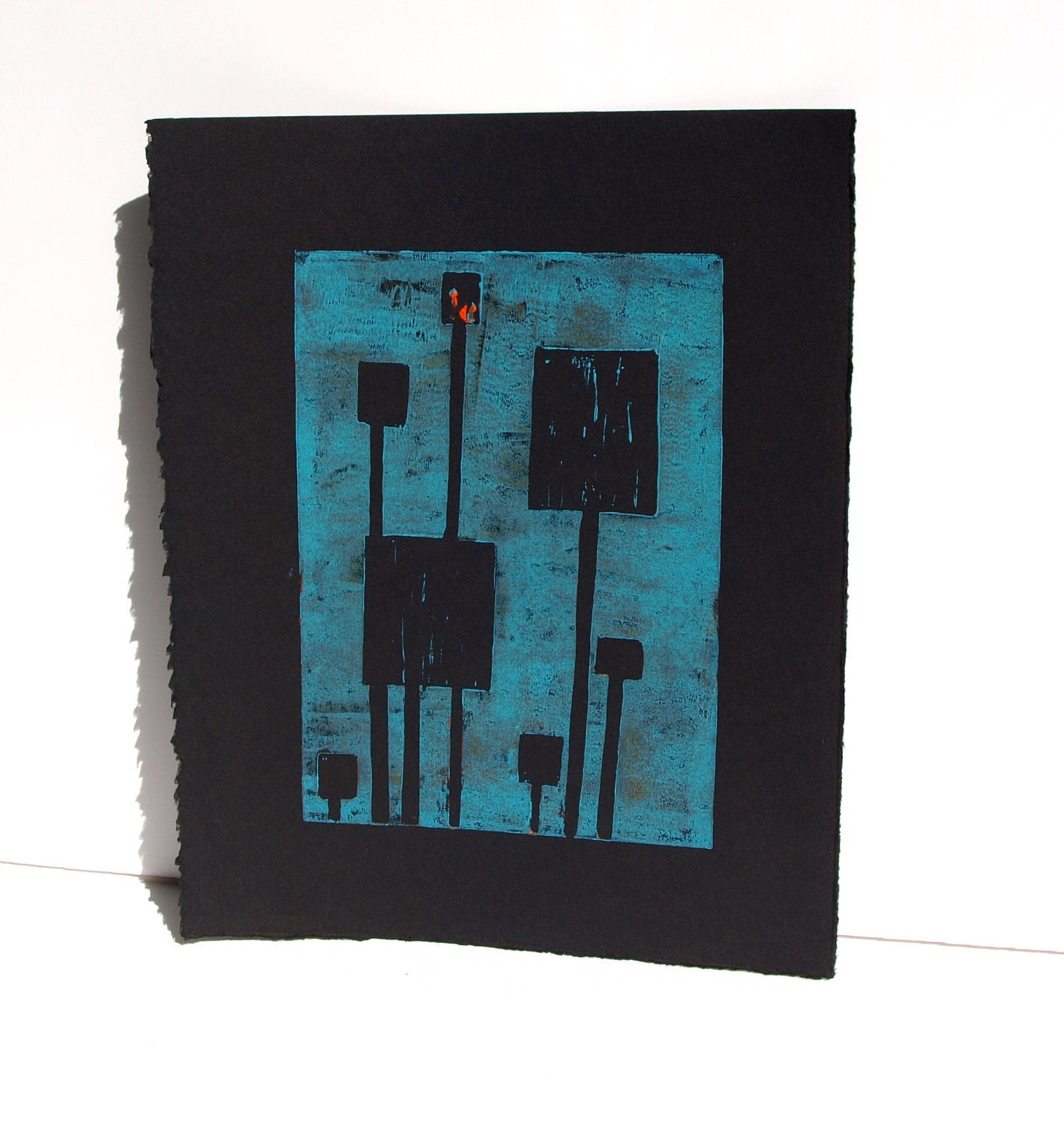
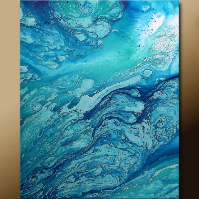
Print 1 - I like the color and the interesting shapes. I think it's cool that it's an actual print too
Print 4 - I like interesting paintings and the colors and the sheen on this paint just makes it different.
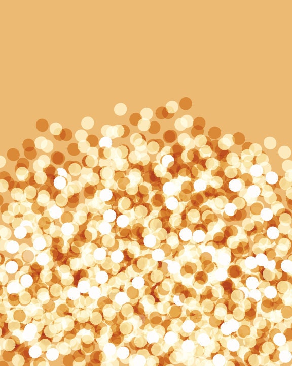
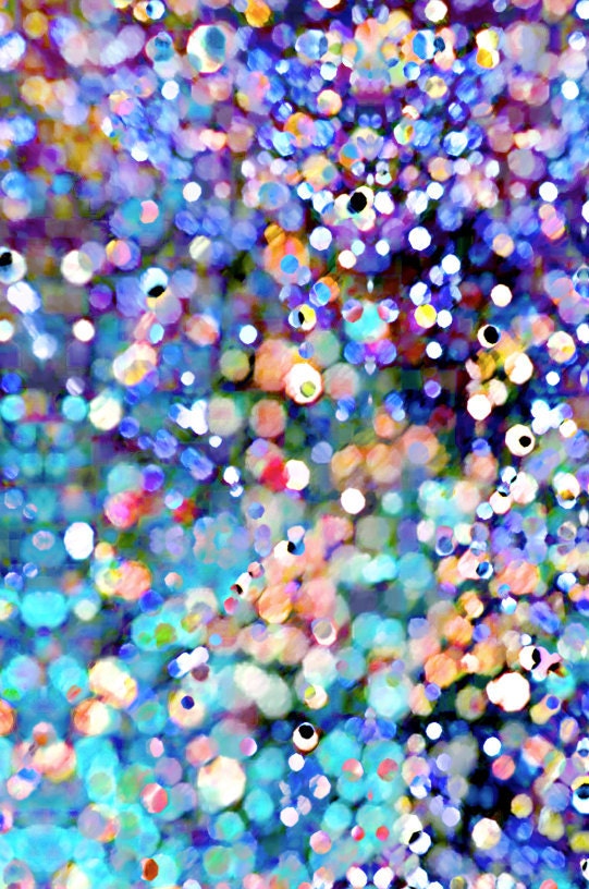
Print 5 - I like the orange color and all the circles. I could look at this picture for a very long time
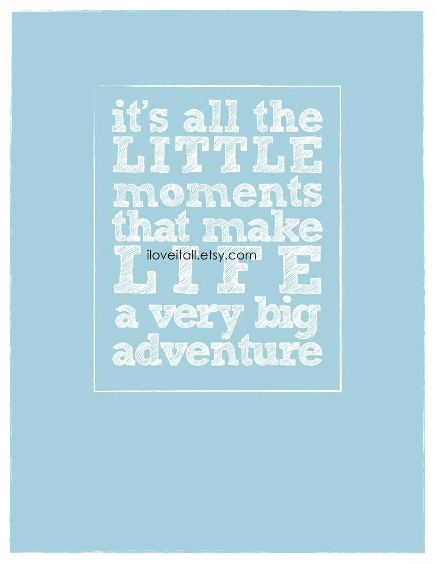
Print 7 - I think this is a really nice quote that would be good to see every day.
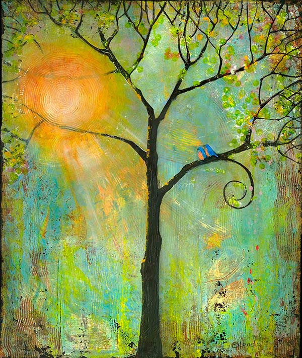
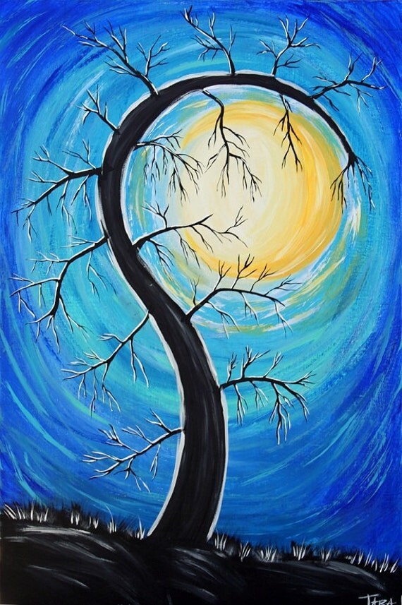
Print 8 - I love this tree... I think it's so sweet. I love the background colors, and the two birds sitting together. I love the sun and the spiral branch... swoon.
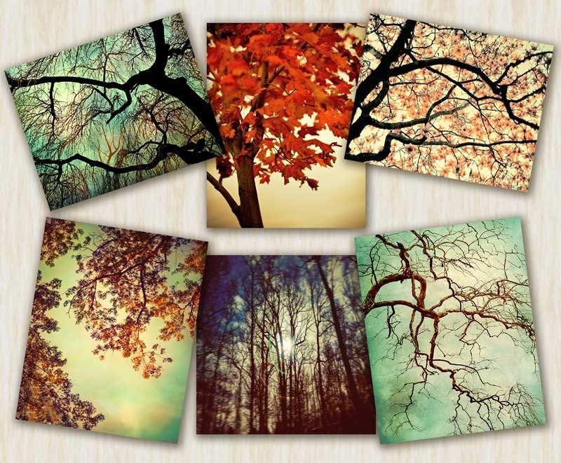
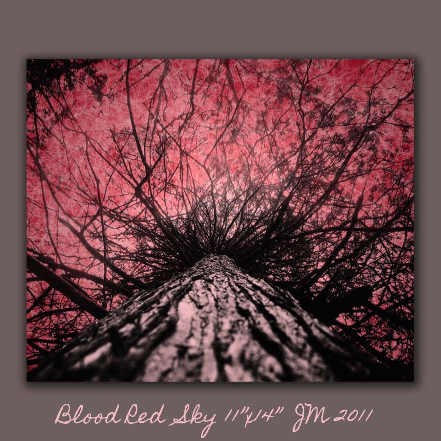
Print 9 - Well, I guess you can see my trend with trees, this little collection of trees could be really pretty in a wall in my future home.
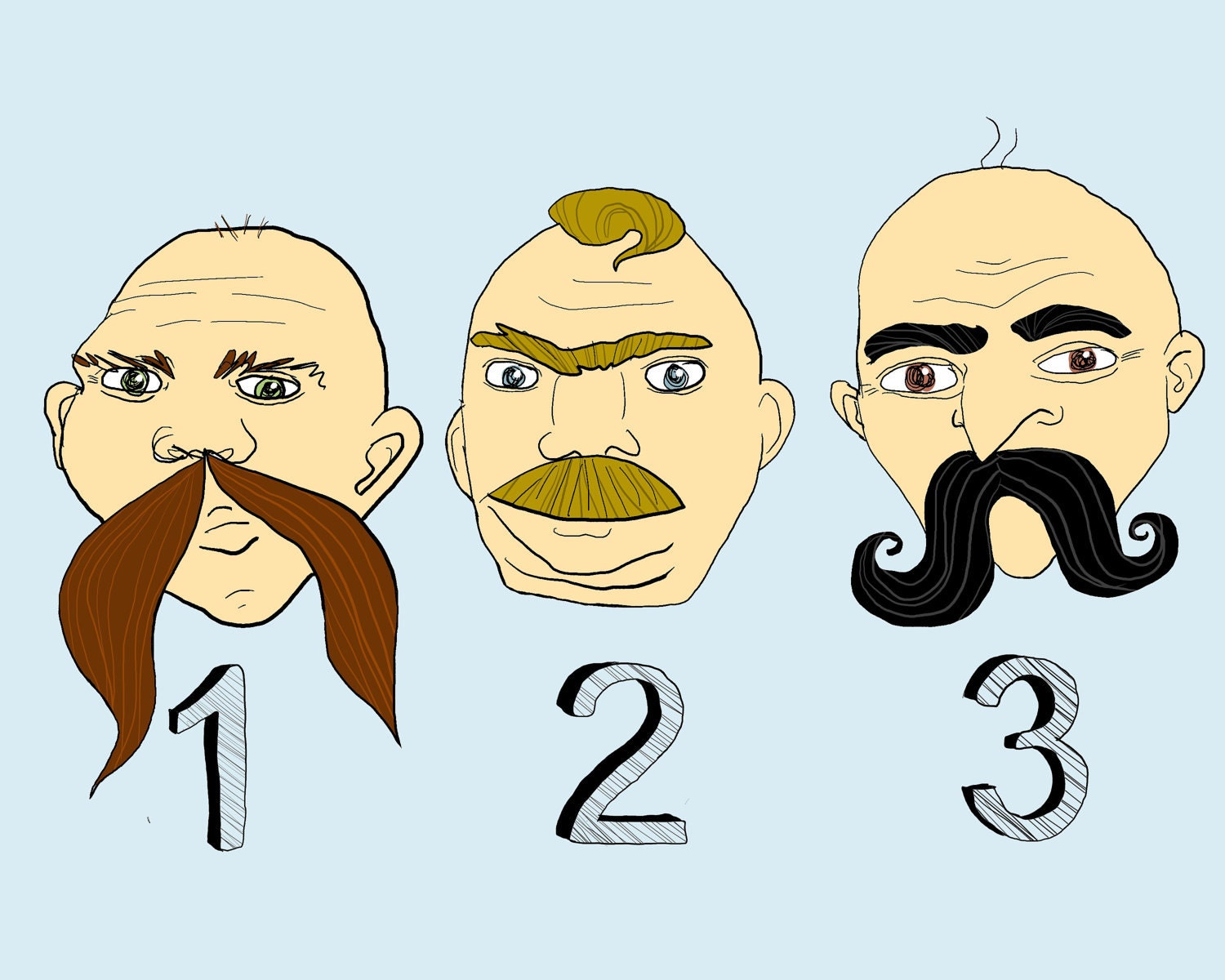
Print 10 - This one you're probably thinking WTF... but I find it charming and different. I think its sorta funny and all the mustaches are funny.
Print 11 - This one is a bit different as it's actually fabric. But I think framed it would look better different and give a different texture to the wall. Plus isn't that background awesome!
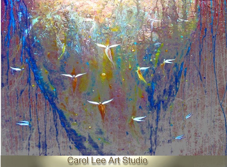
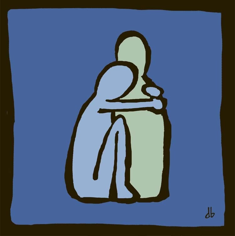
Print 15 - now the artist calls these angels, but I think of birds or fairies. I just thinks it's interesting and different.
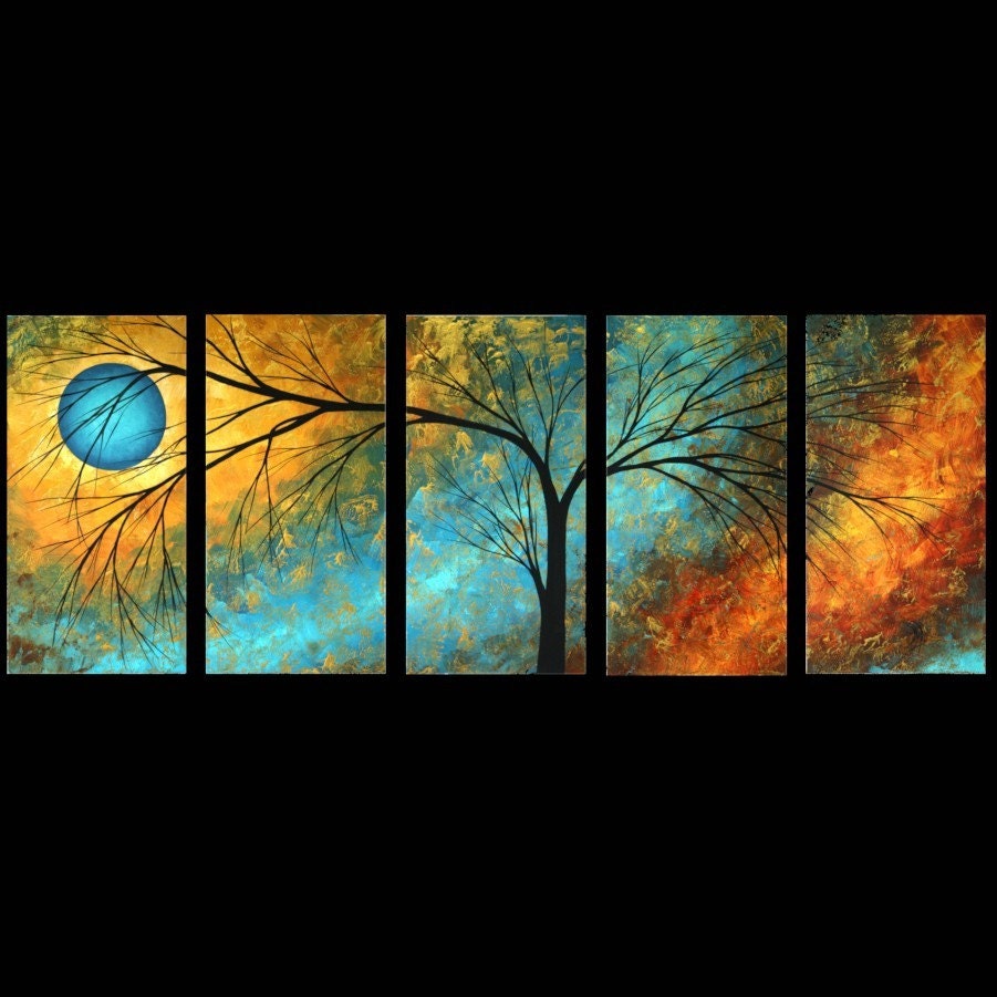
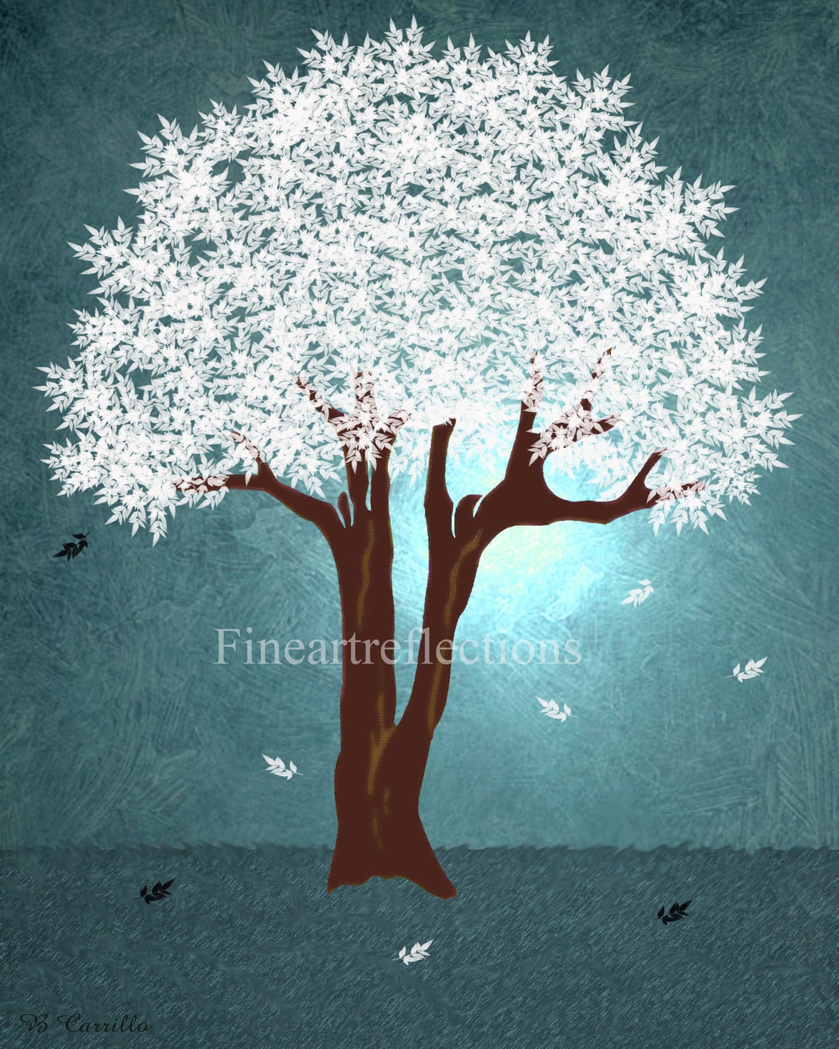
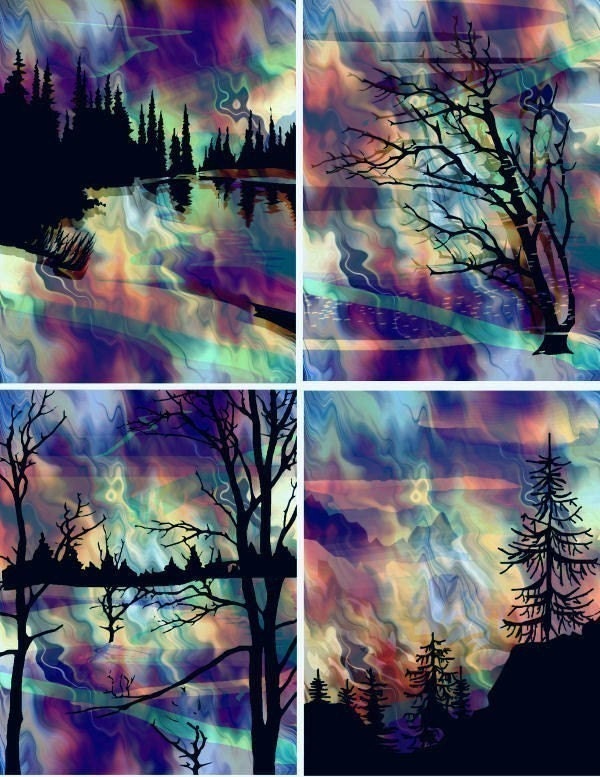
Print 16 - This one is just really pretty. All the different colors and the tree and the moon. I love the blues and oranges and the fact it spans 5 pictures. It would make quite a statement on the wall.
Just realized the print 14 and 17 are the same, haha
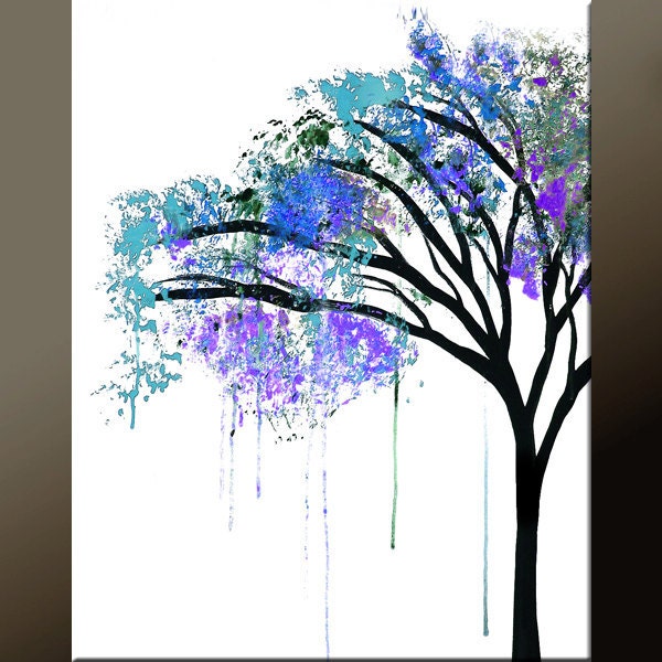
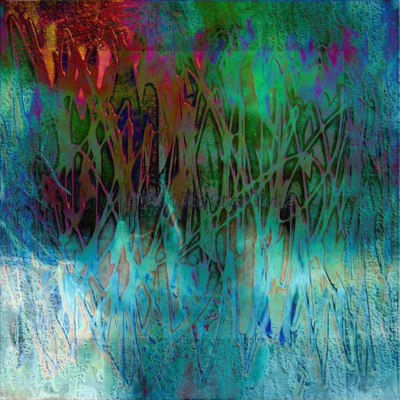
Print 18 - love the colors of the leaves and the fact it looks like sponges... I like how the paint runs a bit and the great branches... so interesting.
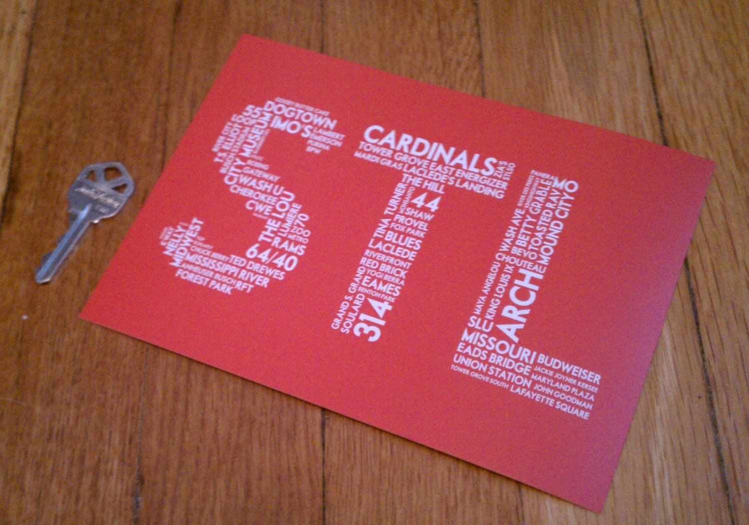
Print 19 - I know this is a post card, but I could see this framed in a photo collage on the wall or in my red accented kitchen.
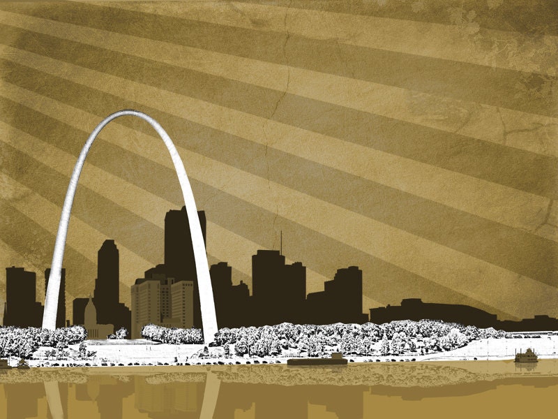
Print 20 - Here's just a nice artist skyline of St. Louis... even though the Arch isn't quite right in dimensions I like it.
1 comment:
Love 4 and 14. Those are some interesting picks!
Post a Comment